What This Service Solves
- Did audience change in a way that matters?
- Was the movement real, seasonal, market-driven, or a sampling issue?
- Which dayparts, demos, or behaviors drove the change?
- What does AQH movement mean for revenue?
- Where are we at risk for ratings-driving revenue declines?
- What ratings levels are required for meaningful revenue growth?
Core Ratings Intelligence
PPM Tools
Structured tools that allow programmers and managers to evaluate station performance across monthly, weekly, daily, and quarter-hour behavior.
First Glance Report
Provides an immediate executive-level read on the latest book as soon as new Nielsen data is available.
Station Performance Report
Organizes the most important performance diagnostics into a structured view.
Example Analysis
We evaluate station performance relative to overall market movement to identify whether audience gains or losses reflect internal factors or broader market conditions.
Station Performance vs Market Movement
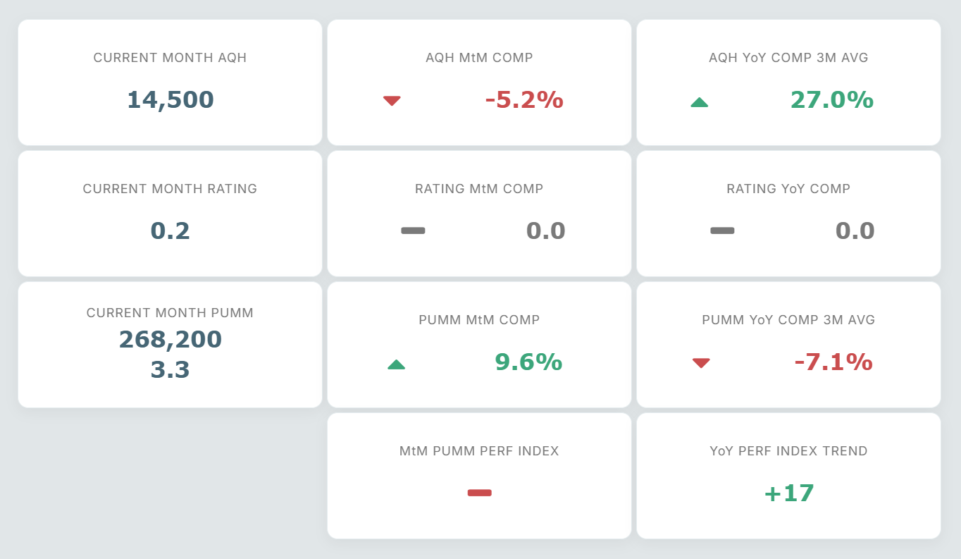
Example: While the station is down month-to-month, it is still 27% above last year. More importantly, the station has outperformed the three month average PUMM Performance Index for 17 months in a row. And THAT is likely to result in positive Miller Kaplan.
Quarter-Hour Audience Performance vs Daypart Benchmarks
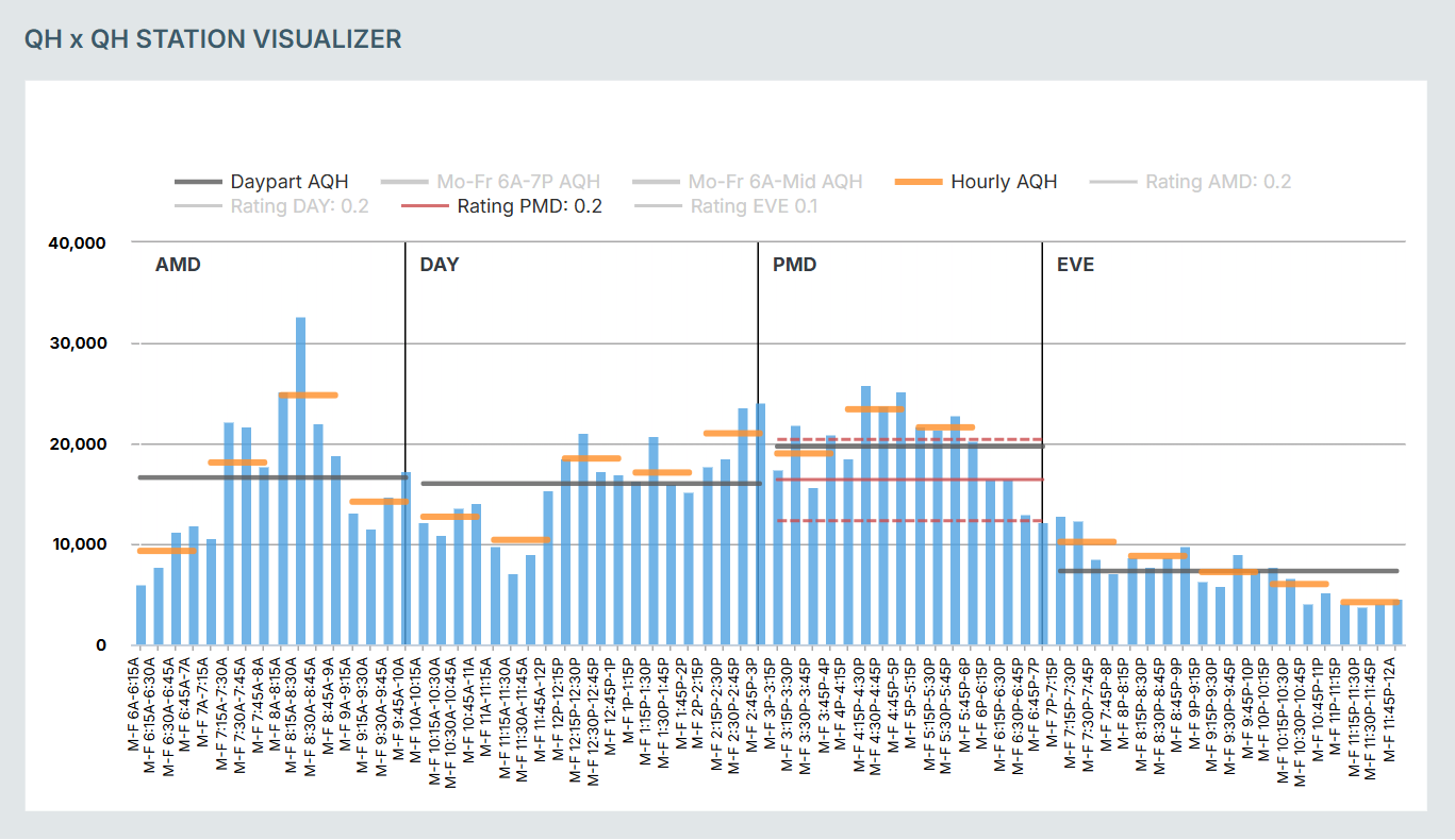
Example: The QHxQH Visualizer shows you how each individual QH and HOUR contribute to the daypart average AQH. In this example, the PMD AQH is just short of adding another tenth of a rating point in the daypart.
Request a Consultation
Ready to understand what the latest book really means? Let’s connect ratings movement to revenue strategy.
Contact Us